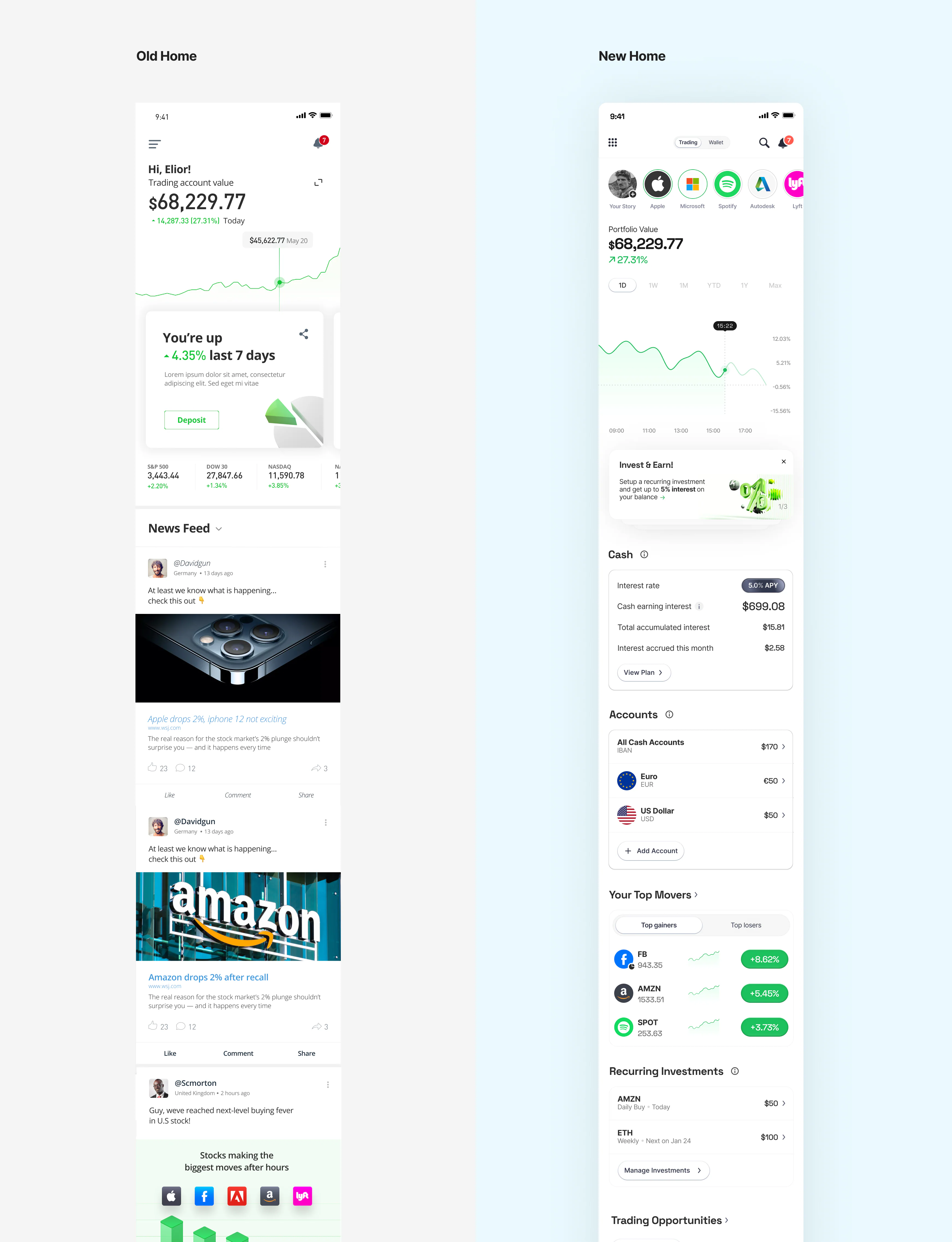
Make the first screen answer something
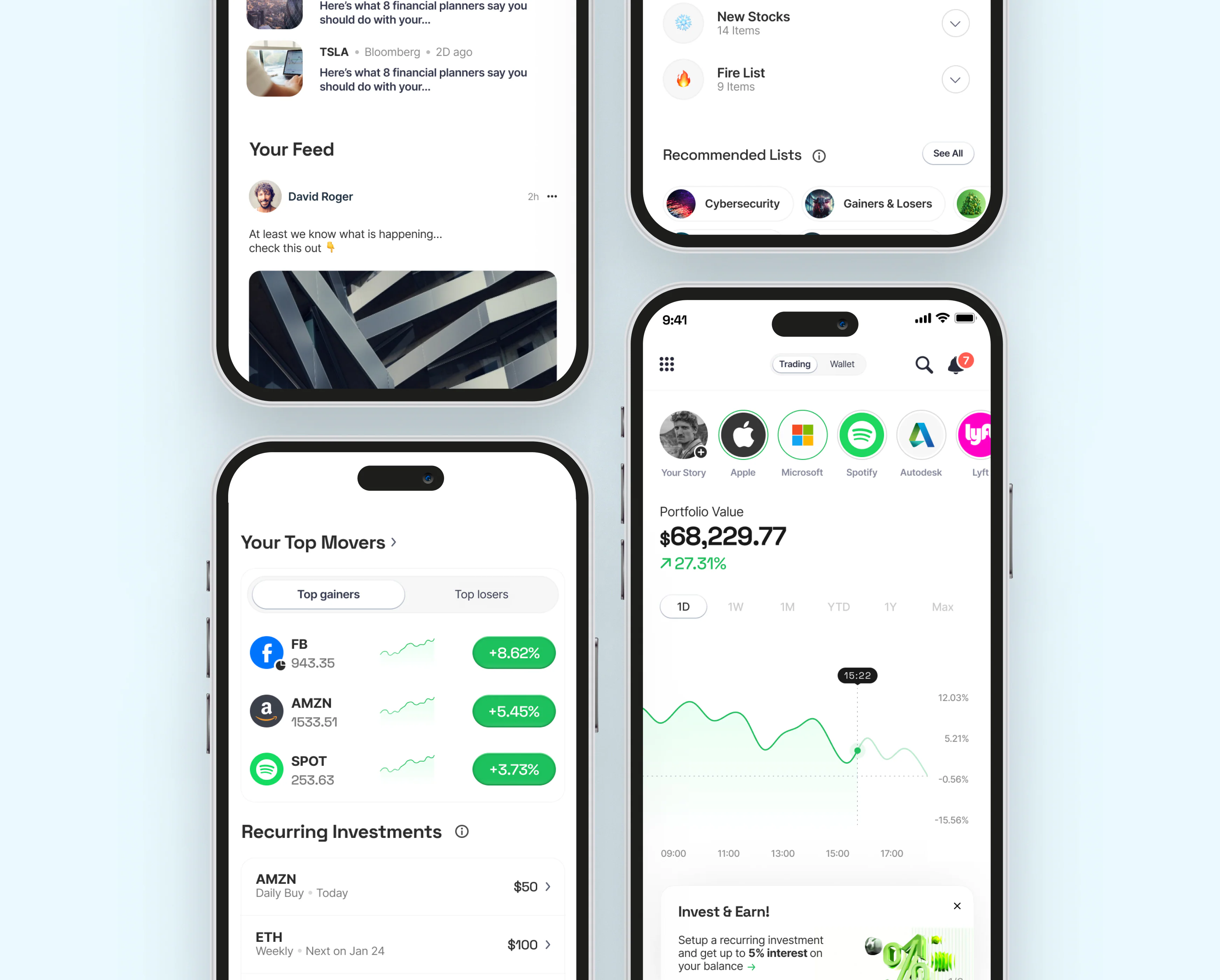
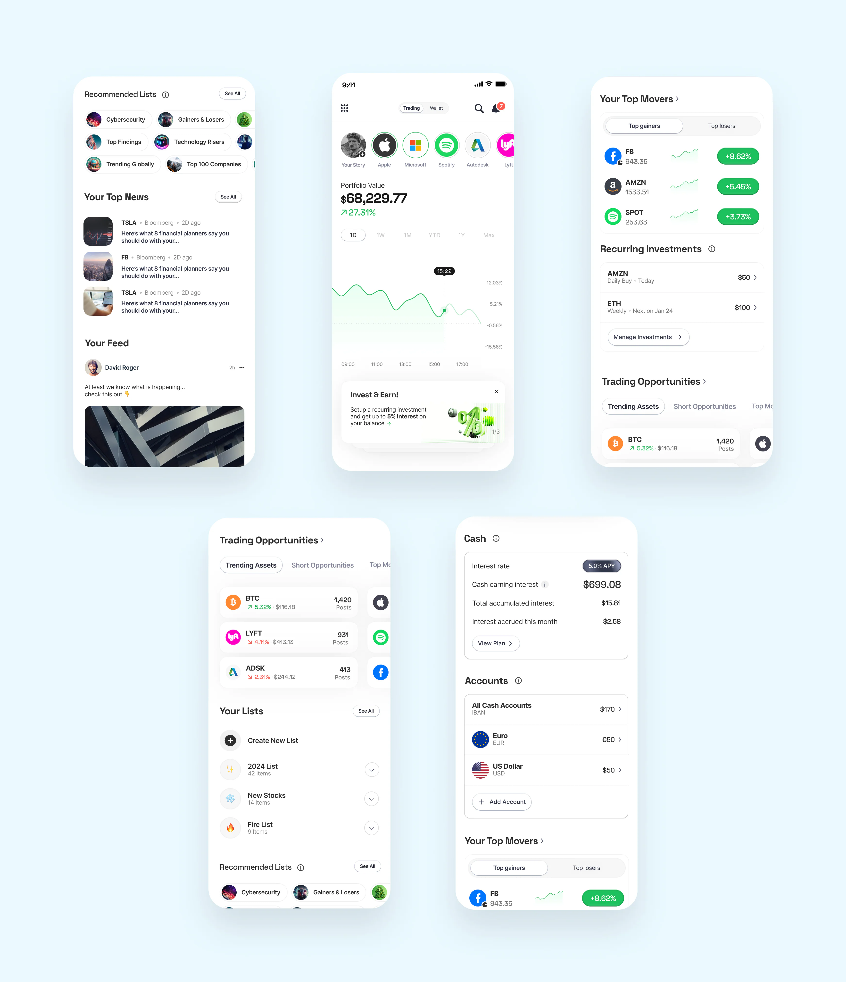
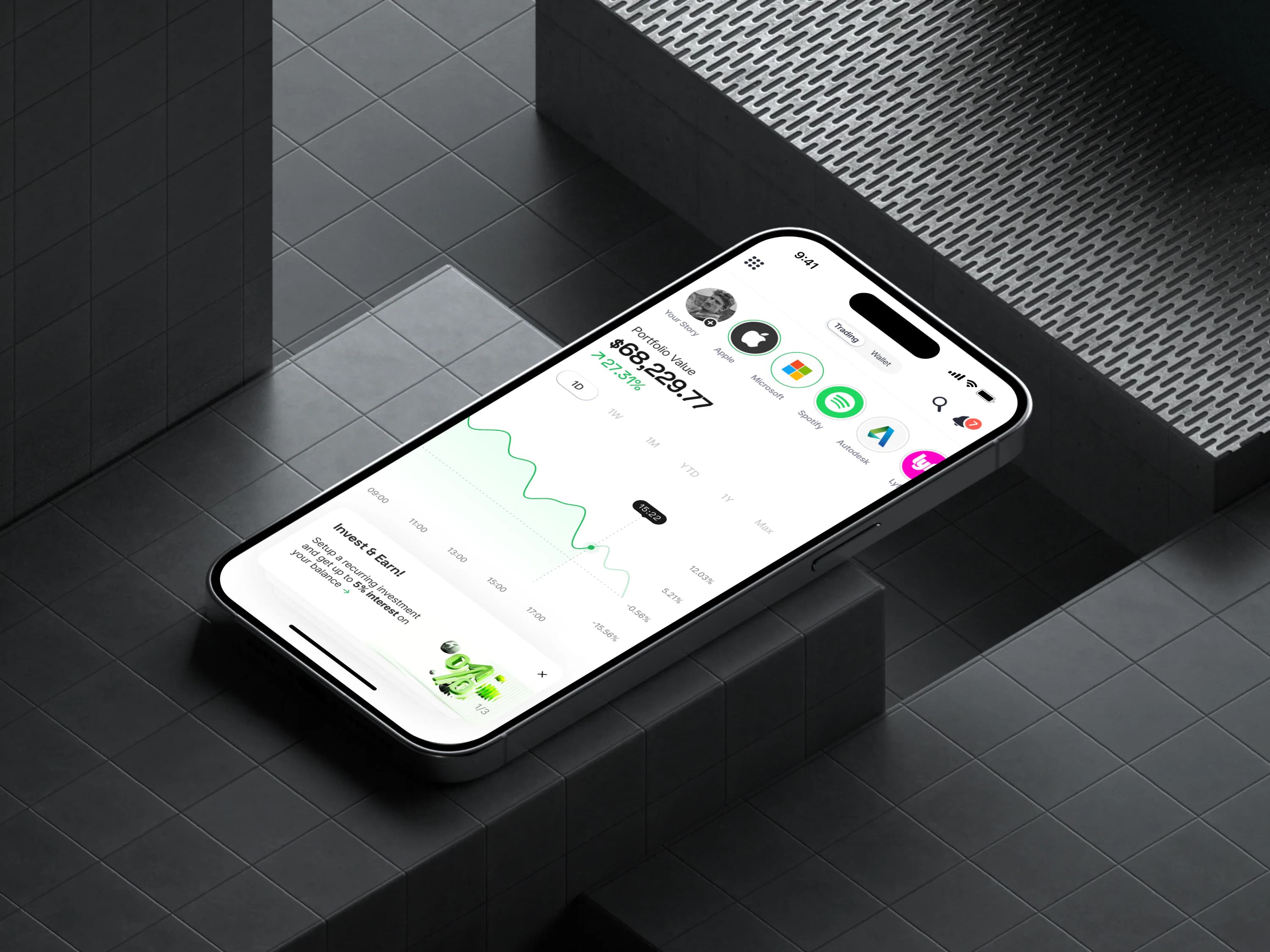
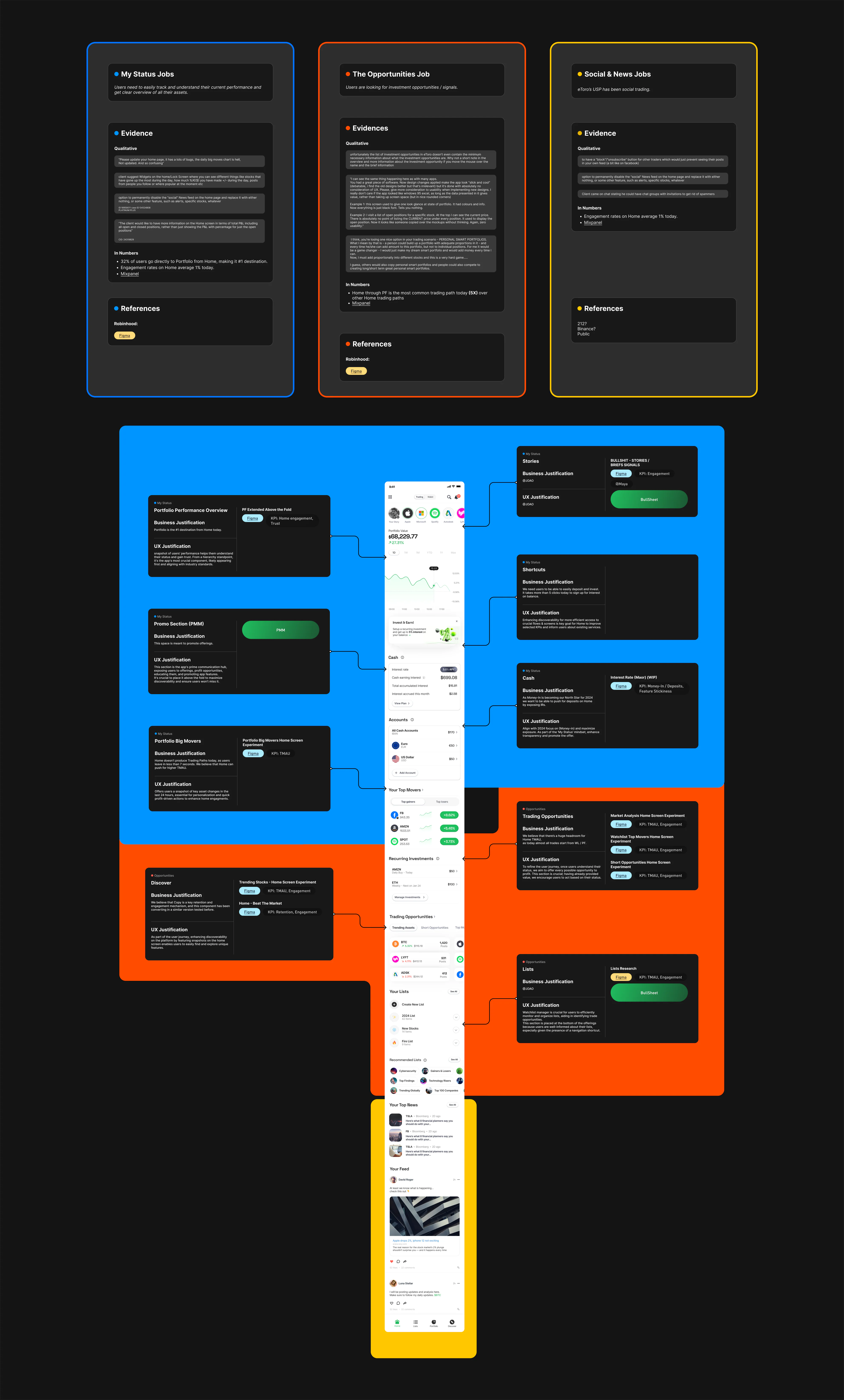
Balances, wallet context, trading content, holdings status, and market data moved into the primary view. Home now explained the account and the opportunities around it instead of acting as a thin entry point.
The goal was not to make Home busier. It was to make the first screen answer the questions users were already leaving to solve elsewhere.
That made the architecture more concrete: account state first, market context second, action paths close to both.