All projects

Guesty

Q4 2025 - Q1 2026 · Desktop

Turning a generic entry point into a role-aware daily workspace for hospitality teams.

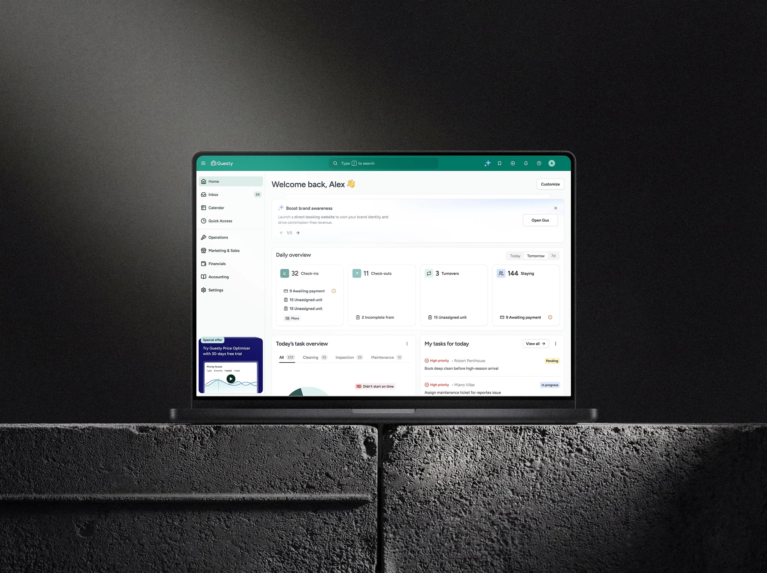
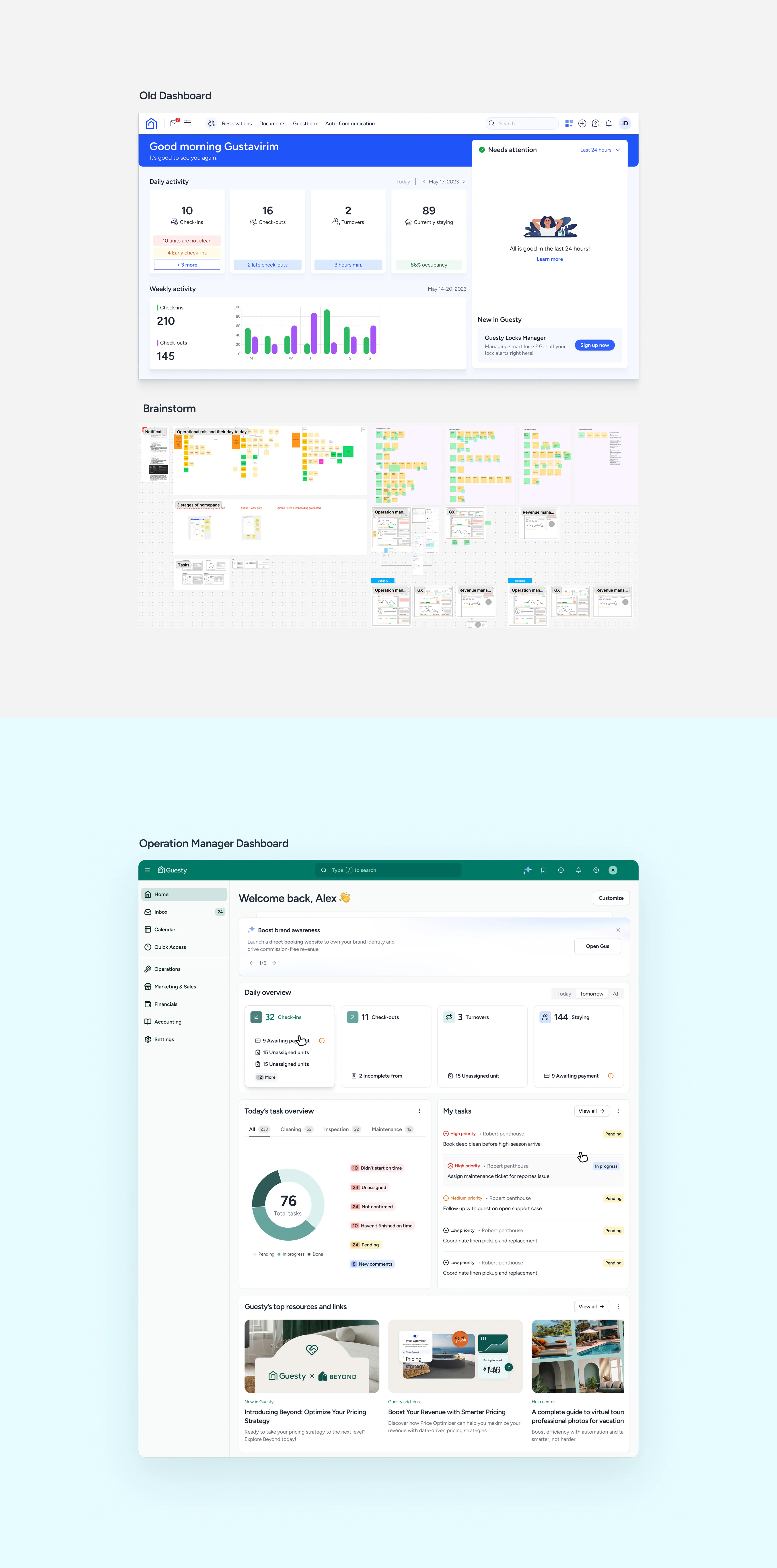
Guesty Pro dashboard, the redesigned daily workspace

Overview

Every hospitality team opened the same Guesty Pro dashboard, but they did not arrive with the same job. Operations needed exceptions, guest-experience teams needed urgent follow-up, revenue teams needed business signals, and finance teams needed control. The old dashboard flattened all of that into a generic entry point. My role covered problem framing, dashboard architecture, and implementation, turning the page into a role-aware workspace where status, recommendations, and actions sat closer together. In the first month after launch, engagement increased 44%, bounce fell 64%, and task-creation time fell 24% across all users.

Role
Senior Product Designer
My focus
Problem framing, role-based dashboard architecture, proactive AI suggestions, and first-release tradeoffs.
Evidence
  • Approximately 10 user interviews and jobs-to-be-done analysis across operations, guest-experience, revenue, and finance roles.
  • Behavioral product analytics reviewed alongside cross-platform navigation patterns.
  • More than 500 product feedback requests reviewed as part of the problem definition.

Process and solution

Guesty Pro dashboard daily workspace

Give the dashboard a job

The dashboard needed to earn its place as the first screen of the day. The new Home view centered the question users brought to it each morning: what needs attention now? Priorities, status, and actions moved onto one working surface instead of forcing users to reconstruct the day across the product.
Four roles, two working modes

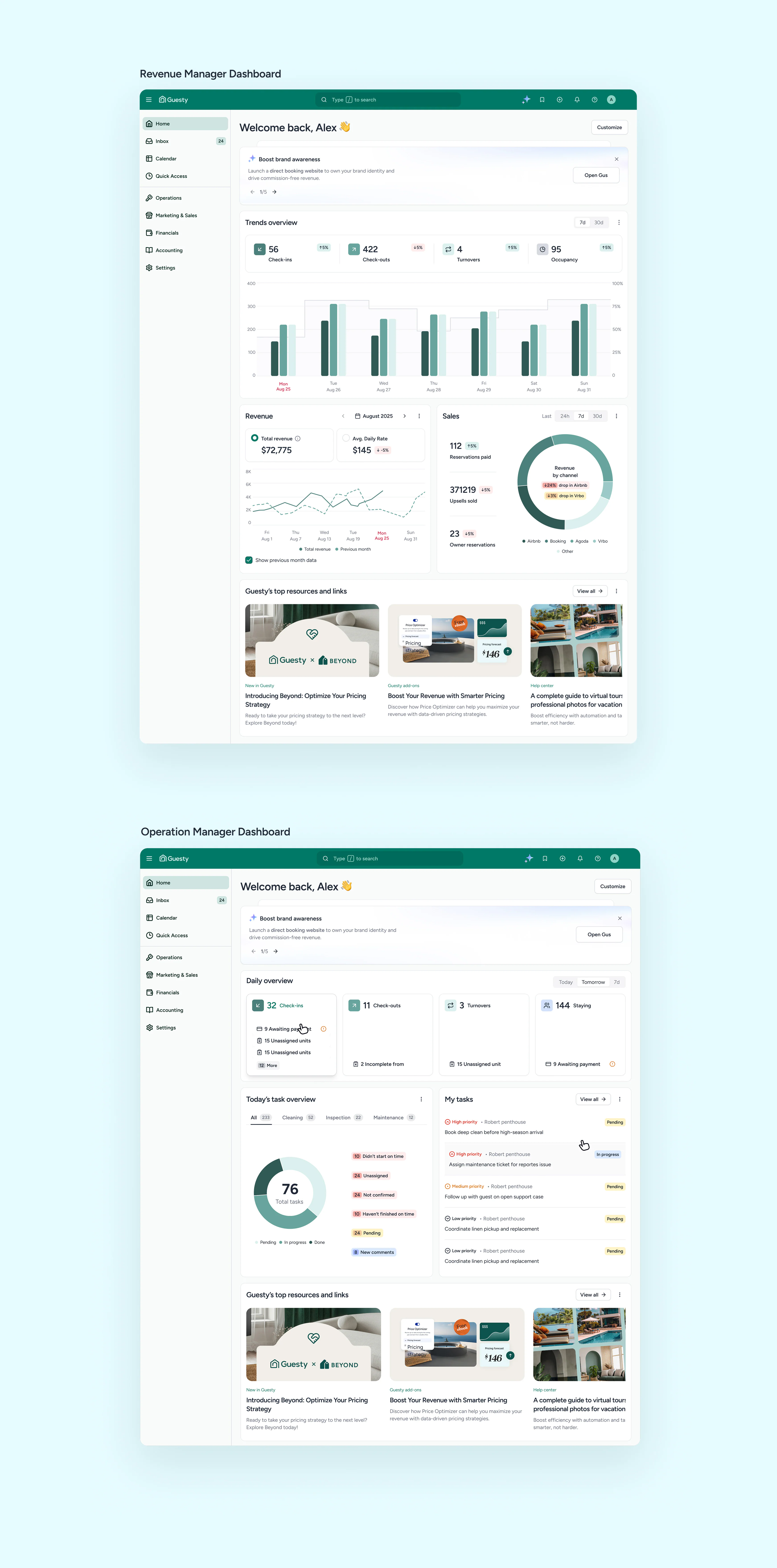
About 10 interviews and jobs-to-be-done analysis showed that four roles did not need four products. Their priorities clustered into operational work and business oversight, giving each group a useful default without splitting the dashboard into separate systems.

Operational and business dashboard views for different Guesty roles

Put action beside the signal

The old dashboard surfaced information without enough connection to the next step. High-frequency actions moved beside the status or recommendation that prompted them, so users could understand an issue and act from the same place.

That was the main product shift: the dashboard stopped behaving like a report and started behaving like a work queue.

Make AI support feel operational

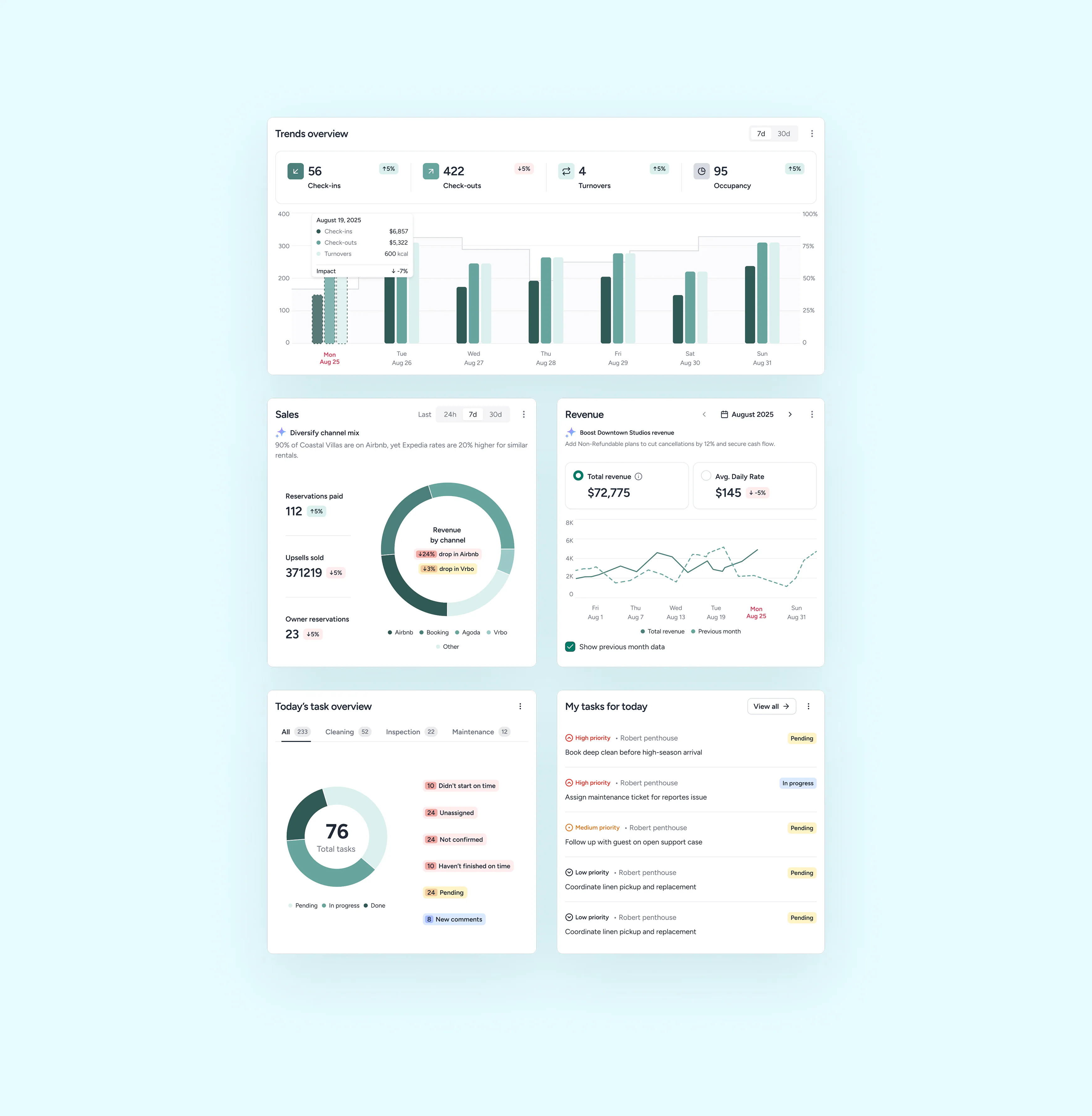
Proactive AI support was integrated directly into the dashboard rather than treated as a separate assistant surface. Recommendations appeared beside the operational context they referred to, helping users spot relevant opportunities while still keeping the workflow grounded in the dashboard.

Guesty dashboard system and scalable component foundation

Key decision

Ship two role-aware need states and defer fully granular per-user customization.

One generic page had already failed. Four role-specific dashboards would multiply design and engineering work. Two defaults covered the main difference in intent while keeping one shared system.

Alternative considered: Ship fully granular per-user dashboard customization up front. / Keep a single generic dashboard and only re-style it.

Outcome

+0%

Dashboard engagement

-0%

Bounce rate

-0%

Time to create task

Looking ahead

The next iteration was a fully modular Home page, so each team could configure the surface around its own workflows without splitting the product into separately maintained dashboards.